Project Timeline:
3 Weeks
My Role:
Research, Ideation, Design, Prototype, Testing
How did this project start?
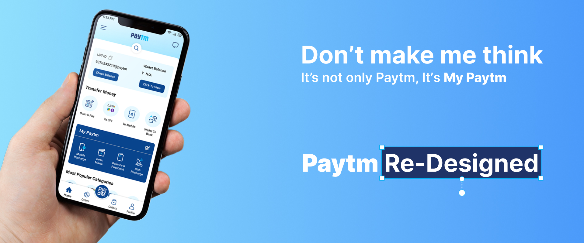
One day, I & One of my friend Saurav were having snacks at a restaurant and he tried to pay the bill with Google Pay, but the app wasn't responding due to server issues. I suggested he use Paytm instead, but he mentioned that he doesn't use Paytm because he finds it difficult to use. He explained that the user interface of Paytm is cluttered and it takes him a long time to find the service he wants to use because the home screen is too busy. As a UI/UX designer, I realized that this issue was likely not unique to Saurav and that the Paytm home screen could be improved. I decided to tackle this problem by redesigning the Paytm home screen to make it more user-friendly.
Secondary Research
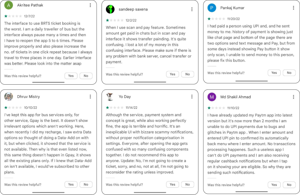
Before I decided to redesign the Paytm app, I wanted to ensure that the issue my friend experienced with the app was not unique to him. I conducted some research by looking at YouTube videos and reading reviews on the Play Store. I found that there were 500+ videos on YouTube teaching users how to use Paytm, which had a total of 7 million+ views, indicating that the app may be more complicated than it needs to be.
Additionally, the reviews on the Play Store indicated that users were not satisfied with the Paytm app's user interface. To further understand the issue, I also included some screenshots related to it.
Primary Research
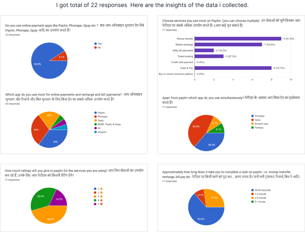
After completing my secondary research, I wanted to gather more data to confirm my findings. I decided to conduct a primary research study using a Google survey and analyzed the data I collected.
User Survey
After completing my secondary research, I wanted to gather more data to confirm my findings. I decided to conduct a primary research study using a Google survey and analyzed the data I collected.
I prepared a survey with Google Forms and distributed it among multiple groups of my knowns. The purpose of doing survey was to understand the basic 'pain-points' of users and gather as much data as possible. Learning about the problems of potential users is a great way to be inspired and motivated. Working with real world data is a good starting point to help avoid guesswork and preconceptions. Using this information provided a better chance to discover the root of the problem and how to solve it. These are the questions which have been asked in survey.
• What is your name?
• What is your email address?
• What is your age?
• What is your employment status?
• Do you use online payment apps like Paytm, Phonepe, Gpay etc.?
• Which app do you use most for online payments and recharge and bill payments?
• Choose services you use most on Paytm. (you can choose multiple)?
• Apart from paytm which app do you use simultaneously?
• Approximately how long does it take you to complete a task on paytm. i.e. money transfer, recharge, bill pay etc.?
• How much ratings will you give to paytm for the services you are using?
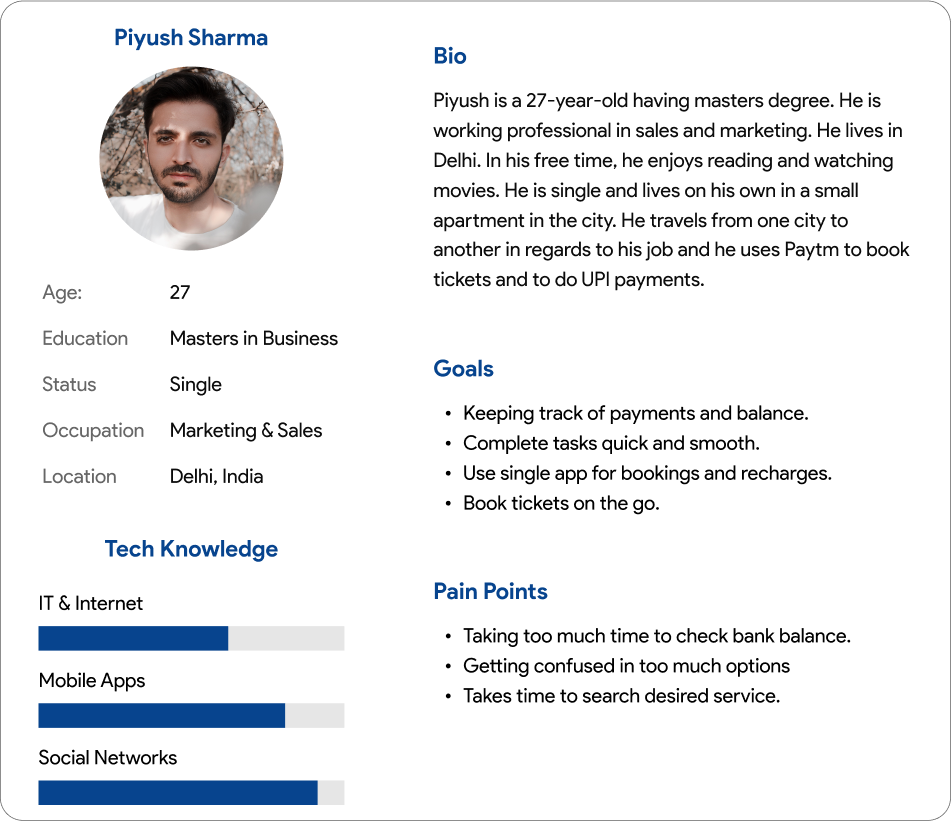
User Persona
The results of my survey suggested that there were several types of users with diverse needs. The accumulation of the different insights and common patterns that came from the users' answers helped me create a persona which is the manifestation of that data in a character.
Problem Statement
Every person has their own unique personality and preferences, and as a UX designer, I noticed that people use Paytm for a variety of tasks, such as booking tickets, making payments, paying bills, and shopping. Paytm has a large number of features and a large customer base, so it can be challenging to meet the needs of all users. UX research has shown that users find the Paytm home page confusing and difficult to navigate. In this case study, I attempted to address this problem by redesigning the Paytm home screen.
Key Highlights
Based on my insights that i gathered from user research, I decided to focus two main problems
CRAZY 8
Since i already have Paytm's app map and i am not making any major changes in flows and architecture so i skipped to include user flows and information architecture in this case study.
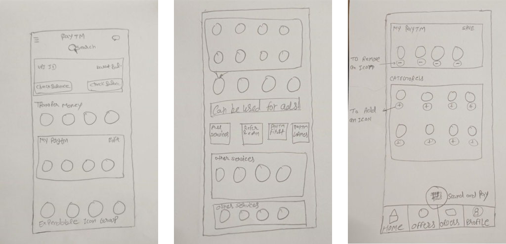
Low-fidelity Wireframes
It was time to start exploring design ideas using paper and pencil. After sketching out several wireframes, I selected the ones that were easiest to use and enhanced the user's experience. The following wireframes were the ones I finalized:
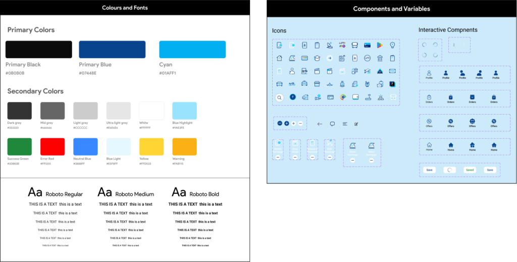
Styles
After completing the wireframes, I moved on to Figma to create Paytm's style and elements. I searched online to see if Paytm had an open design system available, but was unable to find one. As a result, I decided to create my own style guide and elements
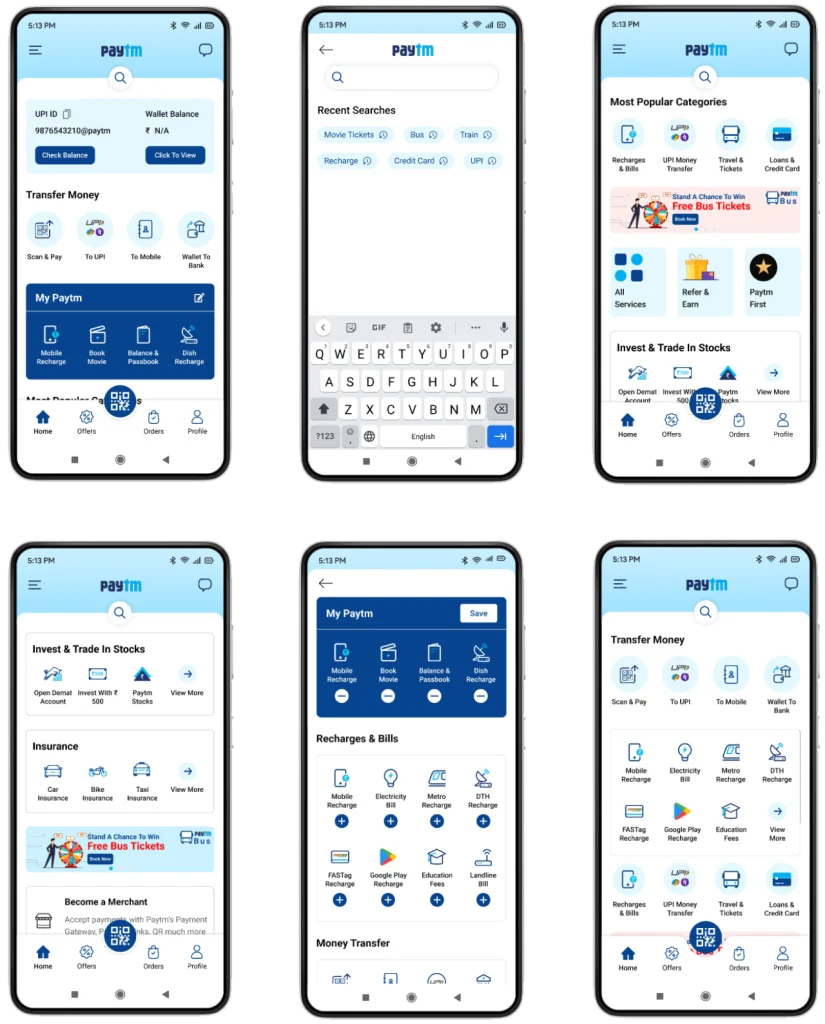
High-fidelity Design
Finally. Wait is over.
I focused on refining the design and adding more detail to the wireframes. I used Figma to create interactive screens that closely resembled the final product. This allowed me to test the design with users and gather feedback on the usability and overall experience.
Usability Testing
After the visual design was complete I tested the prototype with FIVE representative users to see how user friendly the application is. The test was conducted over Google meet video calls and person to person where the participants were asked to use the prototype. I observed how they navigated through the application.
• The participants were able to navigate through the app fairly easily.
• The navigation and app flow is simple and easy to memorize for the user.
• They liked very much customize My Paytm feature.
Suggestions to make the experience better
• Two people were not comfortable with expendable icons.
• One of them suggested to keep search bar on top right.
• Overall they were happy with the new interface as compare to the original one.
My Learnings
During the project, I managed to evaluate the market research, do a quick user survey, create a set of lo-fi wireframes, build them into hi-fi Ul designs, connect them into a prototype, and perform a mini usability study. I learned a lot throughout the whole process and there is a lot of room for improvement and many things to learn. The next steps I would like to take with this project is to continue testing and to explore more ways in which i can give users a wonderful experience.